…there is little evidence to support the widely held view, shaped by the Dartmouth researchers, that the nation’s best hospitals tend to be among the least expensive…
Proposed Medicare Czar likes pretty, pretty pictures.
Moe Lane
RedState
6/4/2010
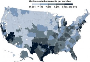
Witness this map.
It’s called the Dartmouth map, and as the New York Times and Hot Air notes, it was used by the Obama administration to argue that there were existing inefficiencies in the Medicare system that could be trimmed away, thus permitting a scenario where Medicare funding could be cut significantly while not sacrificing care (indeed, the map’s creators argue that it demonstrates that cutting Medicare will improve care). In fact, Sir Donald – that being the guy who loves the British Health Service to, ahem, death – is particularly enamored of this map:
Dr. Donald Berwick, nominated by President Obama to run Medicare, called it the most important research of its kind in the last quarter-century. In March, in response to the Congressional Democrats who would have otherwise withheld their support for the health legislation, the administration made a promise. It said it would ask the Institute of Medicine, a nongovernment advisory group, to consider ways of putting the Dartmouth findings into action by setting payment rates that would punish inefficient hospitals and reward efficient ones.
Just one small problem: it’s not actually a map of inefficient care. Just expensive care…
The article continues at RedState.com


